Creating a Call-To-Action (CTA)
Introduction
A "call to action", or CTA, is an important part of any well-designed web page. It's a clear and direct invitation for page visitors to take a specific action. For example, you might ask a page visitor to register for a conference, sign up for a newsletter, or download a resource.
A well-placed and well-written CTA can have an enormous impact on how well a website achieves its goals.
How do you create an effective CTA? The first step is to make sure you have a clear overall strategy and set of goals for your website. What exactly do you want to achieve?
The more specific your CTA is, the better the results are likely to be. Put yourself in the web page visitor&aposs shoes. If your goal is for the visitor to register to attend a conference, it should be really clear how they do that. Don&apost overthink it, and try to keep it simple.
Before you create your CTA, take the time to define your strategy and the specific, measurable goals you want to achieve with your webpage. This will help to ensure your CTA gets the results you want. Thinking carefully about the desired outcomes and what you want the page visitor to actually do will help ensure that you create CTAs that are effective.
This guide was created by the IEEE TechNav team. It provides an overview of how to craft a well-performing CTA, with a step-by-step guide and some reference examples.
The Workflow
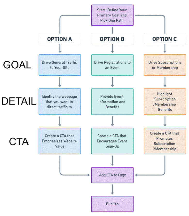
The flowchart below works through the process of creating a CTA for three different goals: driving traffic, driving registrations, and driving subscriptions or memberships. The process for each scenario is essentially the same, but the content varies for each one.
- Start: Define Your Primary Goal and Pick One Path: Begin by choosing your overall GOAL. Pick one of the following paths:
● Option A: Drive General Traffic to Your Site: Aimed at increasing the overall number of website visitors.
● Option B: Drive Registrations to an Event: Focused on getting page visitors to sign up for an event, such as a webinar or conference.
● Option C: Drive Subscriptions or Memberships: Targeted at increasing the number of subscribers or membership signups. e.g. Subscribing to a newsletter, joining a society/initiative/project, or even joining IEEE.

- Based on the GOAL you have chosen, identify the detail you need:
● If you chose Option A: Identify the specific webpage you want to direct your page visitors to.
● If you chose Option B: List some clear and enticing details about the event. Be sure to include any special offers or time-sensitive details.
● If you chose Option C: Summarize the benefits of the subscription or membership. Be sure to include any special offers or time-sensitive details.
- Create your CTA
● If you chose Option A: Create a CTA that highlights the value or unique offerings of your website.
● If you chose Option B: Create a CTA that motivates readers to sign up, emphasizing what they will gain by attending.
● If you chose Option C: Create a CTA that focuses on what subscribers will receive, like exclusive content, discounts, or insider information.
- Add CTA to Page: Place the CTA strategically on your web page, ensuring that it is prominent and relevant to the content. You may want to place the CTA in multiple places, especially if the web page contains a longer post.
- Publish your web page.
Once your web page is live, you should track its performance, and the performance of the CTA. Once you have some data, consider making small adjustments to improve overall performance.
Designing & Placing Your CTA
Placing your CTA strategically on your webpage is vital for maximizing its effectiveness. One of the most important principles is to position your CTA "above the fold". The term "above the fold" originated with newspapers. Newspapers are often folded in half horizontally, with only the top half of the front page visible to potential buyers. This top half was referred to as being "above the fold." The content placed "above the fold" was considered the most important and attention-grabbing, as it was the first thing readers would see when they encountered the newspaper. Editors would place the most compelling headlines, images, and stories in this space to entice readers to purchase the paper and read further.
In the context of a web page, "above the fold" means the item should be visible without the user having to scroll down. This ensures that visitors immediately see the CTA and can easily take action. If your webpage contains long-form content, consider placing the CTA at multiple points throughout the page to provide users with multiple opportunities to engage.
Another key aspect of CTA placement is to make it visually prominent. Use contrasting colors that stand out from the rest of the page elements to draw attention to the CTA. Ensure that there is sufficient white space around the CTA to make it easily distinguishable. Additionally, consider the size of your CTA. It should be large enough to be noticeable but not so large that it overwhelms the page. Lastly, make sure your CTA is mobile-responsive and easily clickable on smaller screens. With the increasing number of users accessing websites through mobile devices, it's essential to optimize your CTA placement for various screen sizes.
By following these placement best practices, you can significantly improve the chances of users noticing and interacting with your CTA, ultimately leading to better conversion rates and achievement of your website goals.
Hypothetical Examples
Here are some hypothetical Call-to-Actions (CTAs) for each path (driving traffic, event registrations, and increasing subscribers). We use IEEE Public Safety as an example target.
OPTION A: Driving Traffic to the IEEE Public Safety Portal
Identified Webpage for Traffic:
The main webpage of the IEEE Public Safety portal.
Craft a CTA that Emphasizes Website
Value:
"Discover the latest
advancements in public safety technology and research. Visit IEEE Public Safety Portal now for cutting-edge insights and resources!"
Or
"Are you passionate about leveraging technology for public safety? Dive deeper into the world of innovation where technology meets humanitarian efforts. Explore our IEEE Public Safety Portal today and gain access to a treasure trove of resources, including white papers, research findings, and expert interviews. Stay ahead of the curve in public safety technology. Your next big idea starts here!"
OPTION B: Driving Registrations to the IEEE Public Safety Conference
Detail Event Information and
Benefits:
The conference is in October 2024, focusing on the latest trends and
innovations in public safety.
Create a CTA that Encourages Event
Sign-Up:
"Join the forefront of public safety innovation! Register for the IEEE
Public Safety Conference 2024 today and connect with experts and peers this
October. Secure Your Spot Now!"
Or
"This October, the future of public safety takes center stage at the IEEE Public Safety Conference 2024. Don't miss this unparalleled opportunity to network with the brightest minds in the field, from innovators in technology to frontline heroes. Discover the latest trends, breakthroughs, and solutions that are shaping the landscape of public safety. Whether you're looking to enhance your knowledge, showcase your research, or find collaborative opportunities, this conference is your gateway. Register now and be part of the movement towards a safer tomorrow."
OPTION C: Driving Subscriptions to IEEE Public Safety Initiatives
Highlight Subscription Benefits and
Offers:
Subscribers get access to exclusive content, updates on initiatives, and
opportunities to participate in public safety projects.
Develop a CTA that Promotes
Subscription Incentives:
"Be part of a community
making a difference in public safety. Subscribe to IEEE Public Safety
initiatives for exclusive updates and opportunities to contribute. Join Us Today!"
Or
"Become a beacon of change in the public safety community by subscribing to the IEEE Public Safety initiatives. As a subscriber, you're not just joining a group; you're becoming part of a global movement dedicated to making the world a safer place through innovation and technology. Receive exclusive updates on groundbreaking projects, invitations to webinars and workshops led by industry leaders, and opportunities to contribute to initiatives that directly impact public safety. Your expertise and passion can drive change. Subscribe today and take the first step towards making a meaningful difference."
Real Examples
The following examples were provided by Chris Franzino in Future Directions. All are from live IEEE sites. They demonstrate several different styles of CTA, and show different methods of including the CTA in the published webpage.
OPTION A: Driving Traffic to the download page for "Beyond CMOS: the Future of Semiconductors" Whitepaper
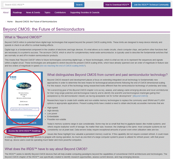
The goal of this CTA was to drive traffic to the download page for the "Beyond CMOS" whitepaper created by IEEE IRDS. A single search-engine-optimized web post was written for the site, and the CTA was added.
Call To Action:
This CTA is a simple button/link that is placed throughout the web post. In this case, the entire page is about the "Beyond CMOS" topic, so further detail isn&apost necessary. An image of the whitepaper is also included. The graphic and button contrast nicely with the surrounding text, and the CTA is also placed above the fold. The result is a compelling and effective CTA.

Example CTA from IEEE IRDS
OPTION B: Driving Registrations to IEEE Quantum Week
The goal of this CTA was to drive registrations to IEEE Quantum Week. Multiple search-engine-optimized web posts were written for the site, and the CTA was added to all of them. In general, having multiple web posts with the same CTA can be very effective in driving website traffic.
Call To Action:
This CTA is placed at the bottom of the page and is in two parts: a simple button/link to the conference website and an invitation to join the Technical Community:
"Interested in joining the IEEE Quantum Technical Community? IEEE Quantum is a global, multidisciplinary community of researchers and engineers dedicated to tackling the challenges related to quantum computing, information, engineering, algorithms, and corresponding technologies. Join today to stay informed of the latest quantum news, events, opportunities, and more."

Example CTA from IEEE Quantum Week
OPTION C: Driving Subscriptions to IEEE Digital Privacy Courses
The goal of this CTA was to drive signups to an IEEE Digital Privacy online course. Multiple search-engine-optimized web posts were written for the site, and the CTA was added to all of them. In general, having multiple web posts with the same CTA can be very effective in driving website traffic.
Call To Action:
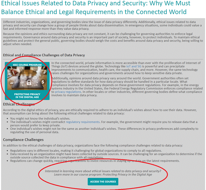
"Interested in learning more about ethical issues related to data privacy and security? Learn more in our course program: Protecting Privacy in the Digital Age. Access the Courses"
The CTA is placed in the middle of the web post (circled at the bottom of the image below), and again at the end of the web post. An image with links to the course is also embedded near the start of the web post. Again, you can see that the image contrasts strongly with the text and the CTA appears above the fold.

Example CTA from IEEE Digital Privacy
Conclusion
The key is to decide why you are creating content and to have a clear goal that you want to achieve. Then you can design your CTA.
Each of these example CTAs are designed to be clear, engaging, and directly linked to the specific action the reader is supposed to take, whether it's visiting a website, registering for an event, or joining an initiative. They provide immediate value propositions and easy access to the next steps for the audience. Remember to be persuasive and clearly outline the value and benefits of taking the suggested action, whether it's exploring a portal, attending a conference, or joining a group.
Once you&aposve mastered the art of creating high-performing CTAs you can start to experiment more e.g. adding more than one CTA to a single web page. However, for the best results, it is almost always best to keep your web page visitors focused on a single task.
